

Card Carousel
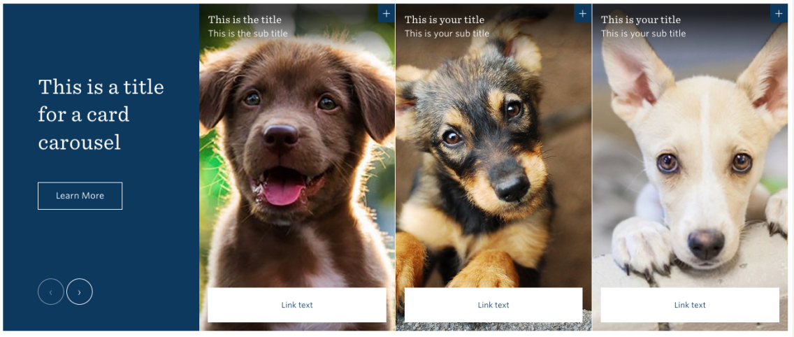
The Card Carousel component allows editors to highlight four or more pieces of information with a photo, blurb, and link to additional information.
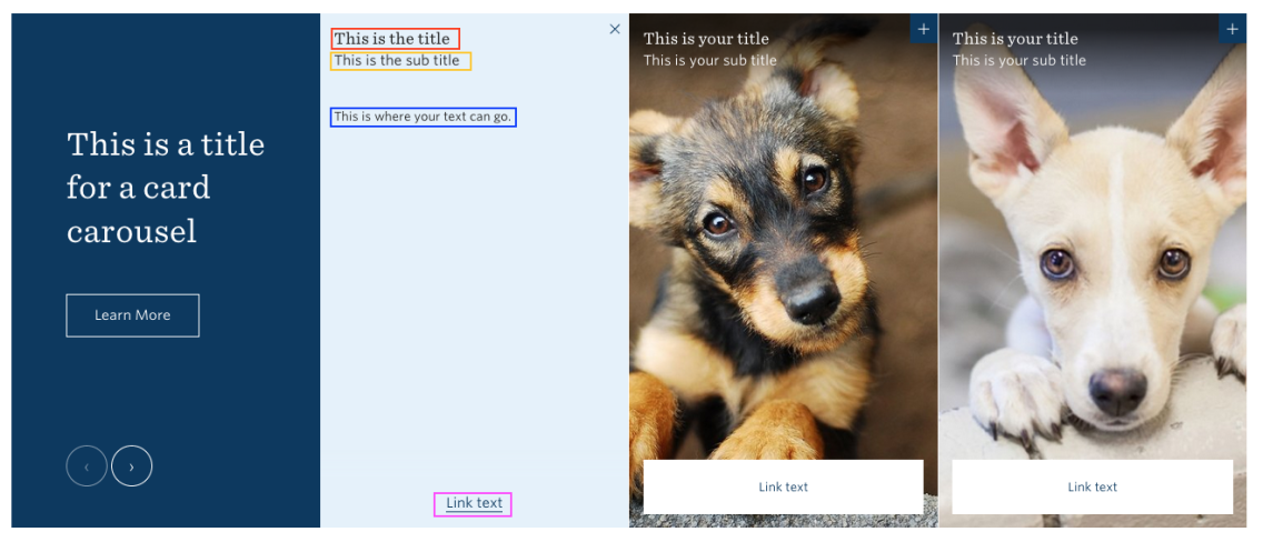
One side of the “card” has a title, sub-title, photo, and link.
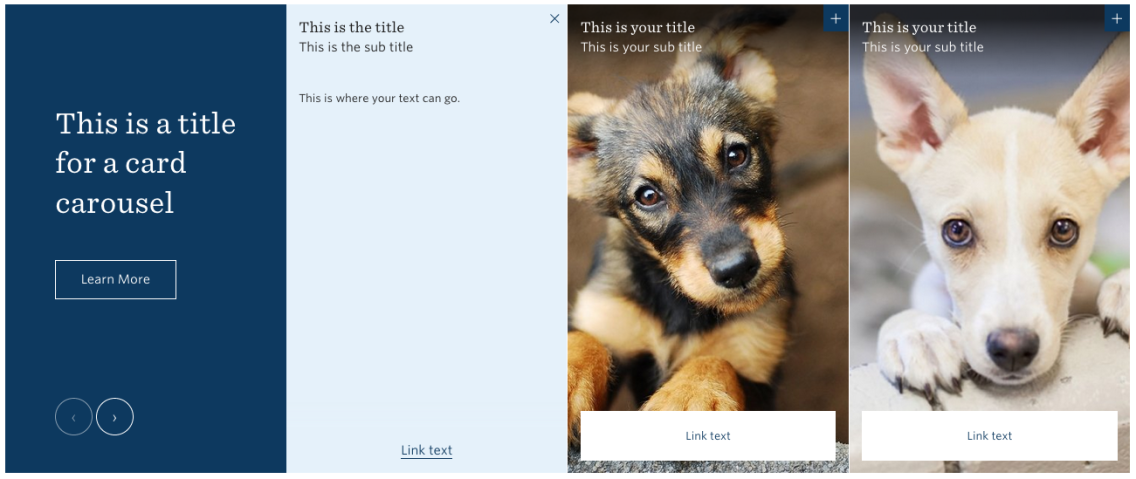
The other side of the card, accessed when the user clicks the “+” sign, has a title, sub-title, text, and link.
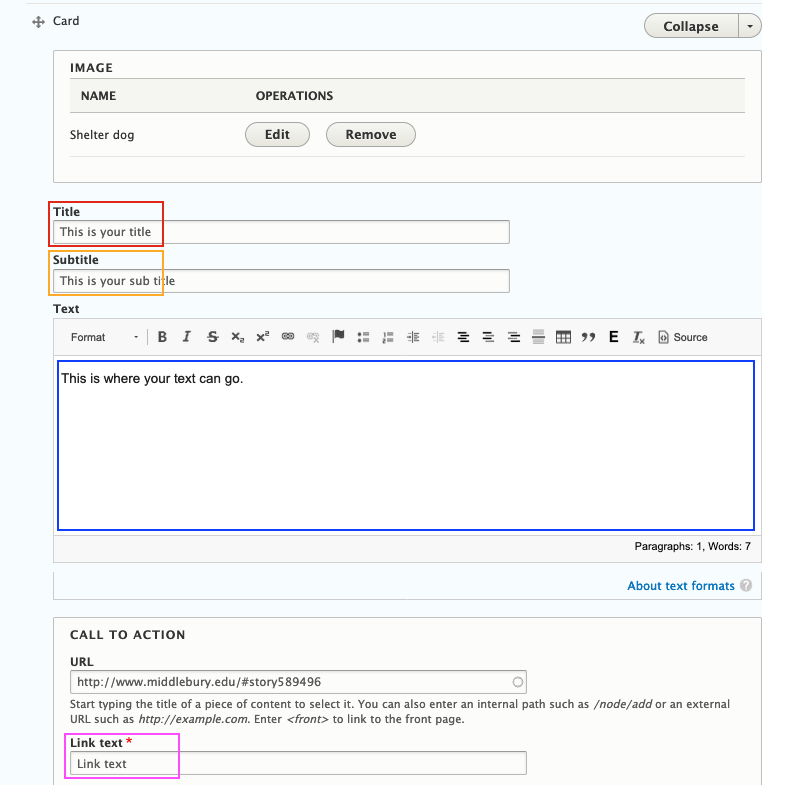
When you are creating the card carousel, the editing interface will look like this, with several fields available for you to populate.
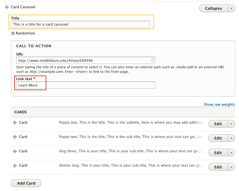
Here, you see:
- Title field
- The option to randomize the order in which the images display each time the page is reloaded
- The call to action url underneath the title for the card carousel
- The link text for the url
This will always appear in the far left of the card carousel in a blue box.
Underneath these fields you have an opportunity to add the first card (you need a minimum of three for the carousel to work properly).
Once you select “Add Card” you will see options to:
- Add an image
- Add a title, subtitle, and text
- Call to action url, and url link text
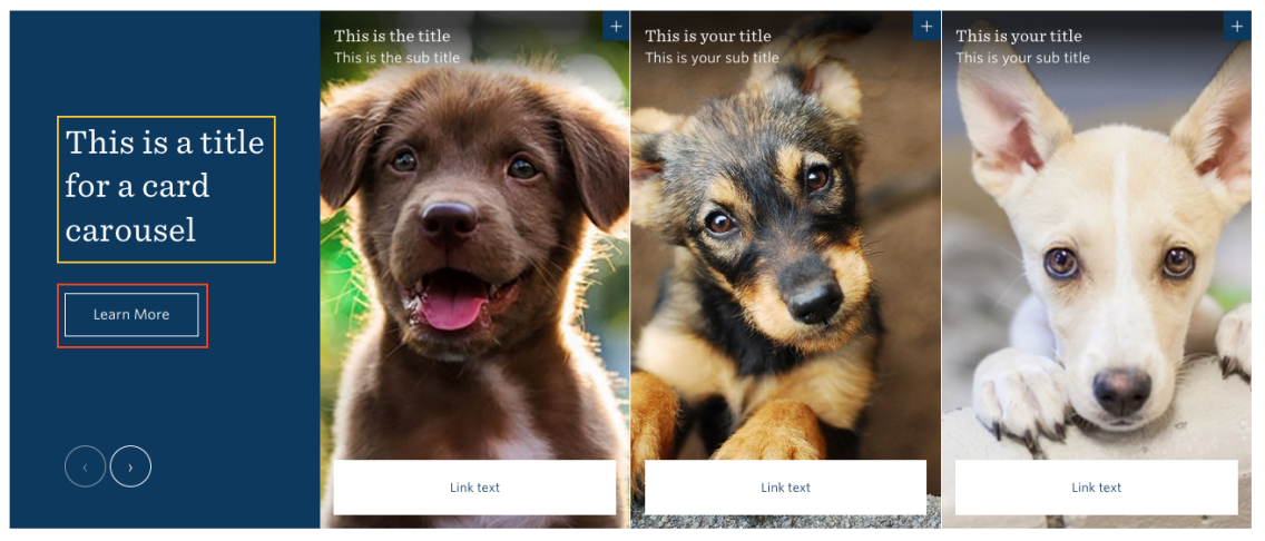
Once complete, your card will look like this:
Once you’ve added your cards, Save your work.