

Mega Call to Action (CTA)
The Mega CTA component is available for Top Level page types only.
A Mega Call to Action (CTA) component is used to provide users with a single call to action, and is larger than a button component, which also provides users with a single call to action.
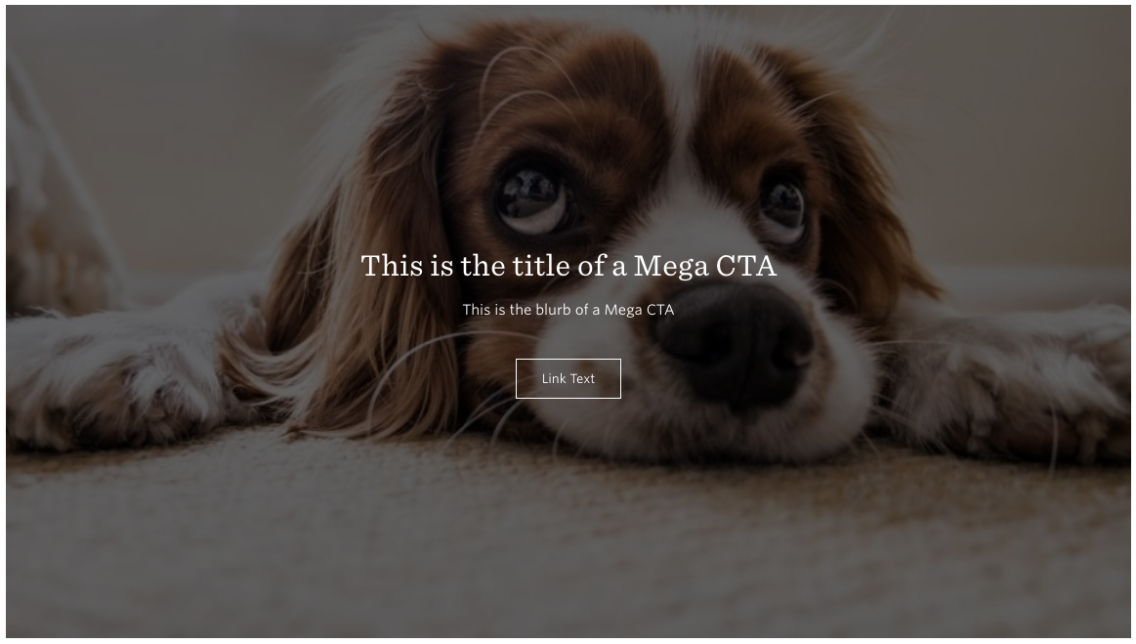
In this case, the CTA reads “Link Text”, the blurb reads “This is the blurb of a Mega CTA”, and the title reads “This is the title of a Mega CTA”.
These are written to illustrate to you, the editor, where the text in each field will display for the user.
When you choose to add a Mega CTA component to your page, you will see this editing interface:
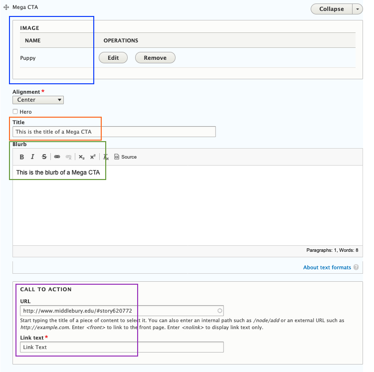
You can see the Image field, Title field, the Blurb field, and two fields for the Button: URL and Link text.
When filling out the fields, keep in mind
- Adding an Image to the Call to Action should work to draw the reader in and relate to the Call to Action;
- The Title should let the user know what information they will find by clicking on the button, in less than five words;
- The Blurb is your opportunity to explain a bit further what information the user will find by clicking the button but again, should be short and succinct;
- The URL is the address of the page or form the user will be directed to when they click the link, and
- The link text is the word or words displayed on the button and should let the user know what they will do by selecting the link, for example, “Learn More”, “Apply Now”, or “Sign Up”.
Click the blue “Save” button at the bottom of the page.