

Call-to-Action Group (CTA Group)
The CTA Group component is available for Top Level page types.
A Call to Action (CTA) group component is used to provide users with four actions they might find helpful as they navigate your website. A CTA group looks like this

In this case, the four CTA’s are “Learn More”, “Application Information”, “Get Started”, and “Graduate Programs”.
Each CTA has a Title, a Blurb, and a Button.

When you choose to add a CTA Group component to your page, you will see this editing interface:
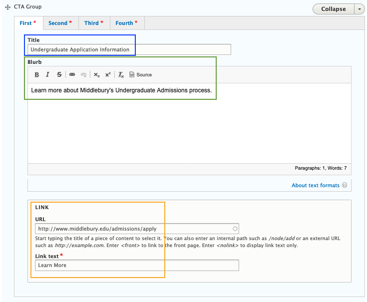
You can see the Title field, the Blurb field, and two fields for the Button: URL and Link text.
Also, above the title, you can see “First”, “Second”, “Third”, and “Fourth”. These tabs exist because a CTA Group requires four CTA’s. By clicking on “Second”, “Third”, etc. you can fill out the fields for each of the four CTA’s.
When filling out the fields, keep in mind
- The Title should let the user know what information they will find by clicking on the button, in less than five words;
- The Blurb is your opportunity to explain a bit further what information the user will find by clicking the button but again, should be short and succinct;
- The URL is the address of the page or form the user will be directed to when they click the link, and
- The link text is the word or words displayed on the button and should let the user know what they will do by selecting the link, for example, “Learn More”, “Apply Now”, or “Sign Up”.
Once you have filled out the fields for each of the four CTA’s, click the blue “Save” button at the bottom of the page.